Health Guide
UX Case Study
2023

Initial Story
Everyone desires a healthy life, but many working-class individuals struggle to prioritize their well-being due to busy schedules and a lack of health awareness.
Additionally, fitness centers are often expensive and fail to meet expectations.
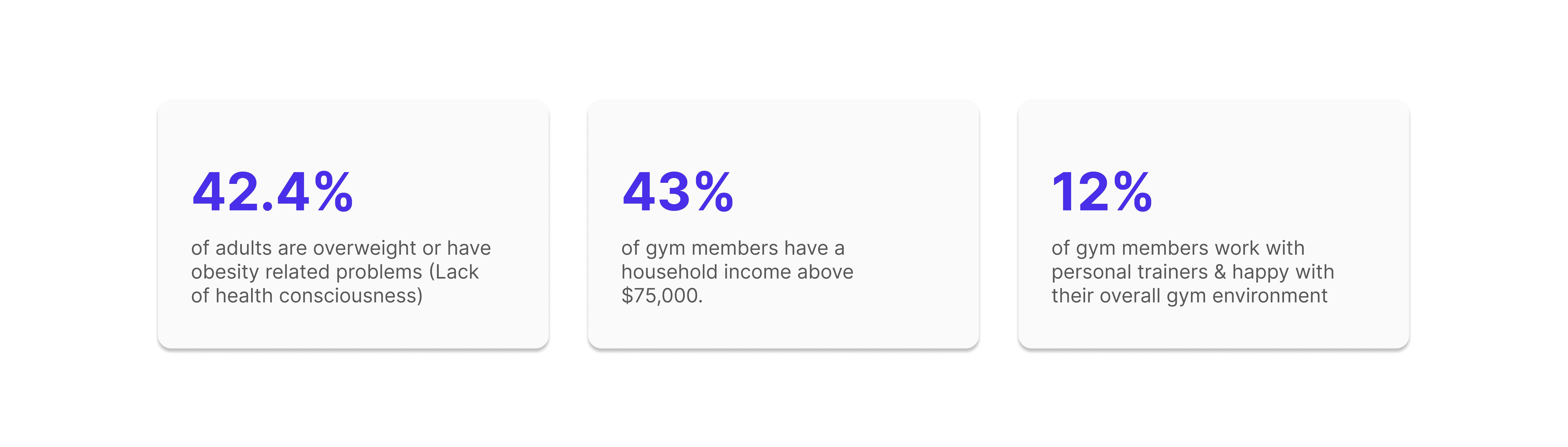
Source: NIH & Mirrors Delivered
Problem
So, to summarize the problems, we have found
People usually don't know what their bodies really need and how to achieve that
Fitness centers are costly and often time-consuming
Low to mid-range fitness centers lack professional trainers and proper equipment
Potential Solution
Their pain points can be solved through a platform that can
Offer personalized fitness suggestions
Have sufficient professional trainers and equipment
Help people achieve their fitness goals with less time and low to zero cost
According to the pain points and the potential solution, I envisioned an online platform that could lessen dependence on traditional fitness centers, while also alleviating some of the burden on fitness organizations.
Targeted Audience
This health guide is designed for budget-conscious individuals over 20 years old who are passionate about health and wellness.
My Design Process
Here is how I developed the Health Guide from its early phase
This iterative process ensured that the Health Guide adheres to high design standards and meets user needs

My Research On Similar Platforms (Competitive Analysis)
Upon identifying the issues and potential solutions, I chose to investigate comparable applications to understand some features including inspiration techniques, goal planning systems, health guidelines, and journaling.
My analysis focused on Google Fit and My Health - Steps, Jogging, both of which have garnered positive ratings on the Google Play Store.
See the full 'Competitive Analysis' here
My Research On Potential Users for Health Guide
To gain deeper insights beyond competitor analysis, I investigated some habits and behaviors of potential users. Specifically, I focused on realizing:
Their understanding of good health
Their most common physical activities for health improvement
Their most desired wish lists for their health
Their trust in doctors and existing healthcare systems
Their health consciousness, confidence, and secrecy
I developed a two-pronged user research approach. A quantitative survey was designed to gather user data, while in-depth interviews provided qualitative insights.
Insights
See the full report of 'Survey & Interviews' here
Device Selection
Participants expressed a preference for a health app on their mobile devices, valuing the convenience of access and portability.
In response to this feedback, I focused my efforts on developing a mobile application.

Structuring User Bases & Their Possible Actions
In order to structure my user research and identify potential user actions, I utilized a variety of techniques such as
User Persona:
I segmented the user base into categories based on age, demographics, and profession, which led me to identify three distinct subgroups of potential users
User Journey Maps:
Next, I determined the potential actions they might take with Health Guide, taking into account their personalities and circumstances
Task Analysis & User Flows:
To visualize potential user journeys, I created flowcharts that map out the actions users can take within the Health Guide to achieve their desired outcomes.
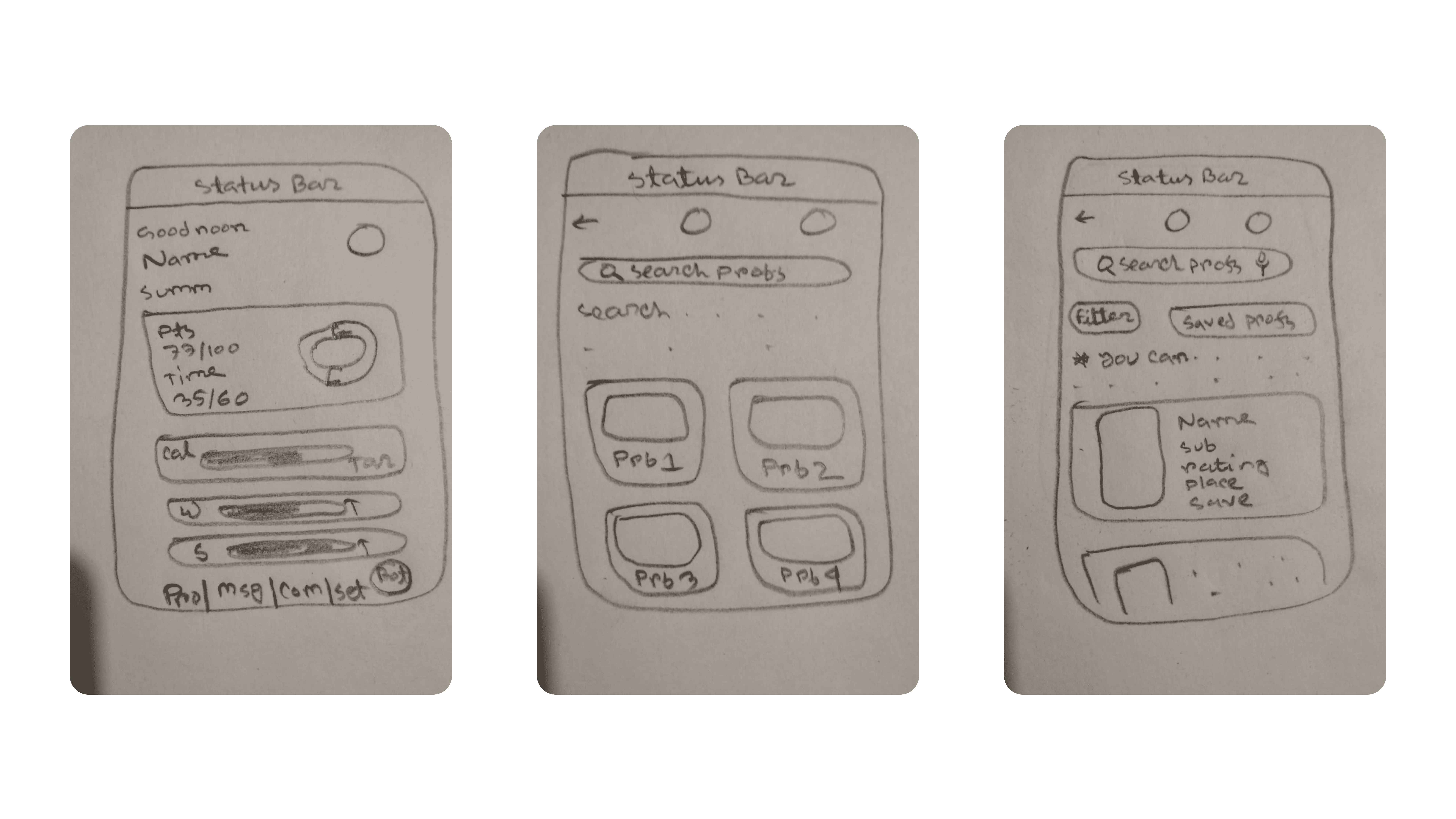
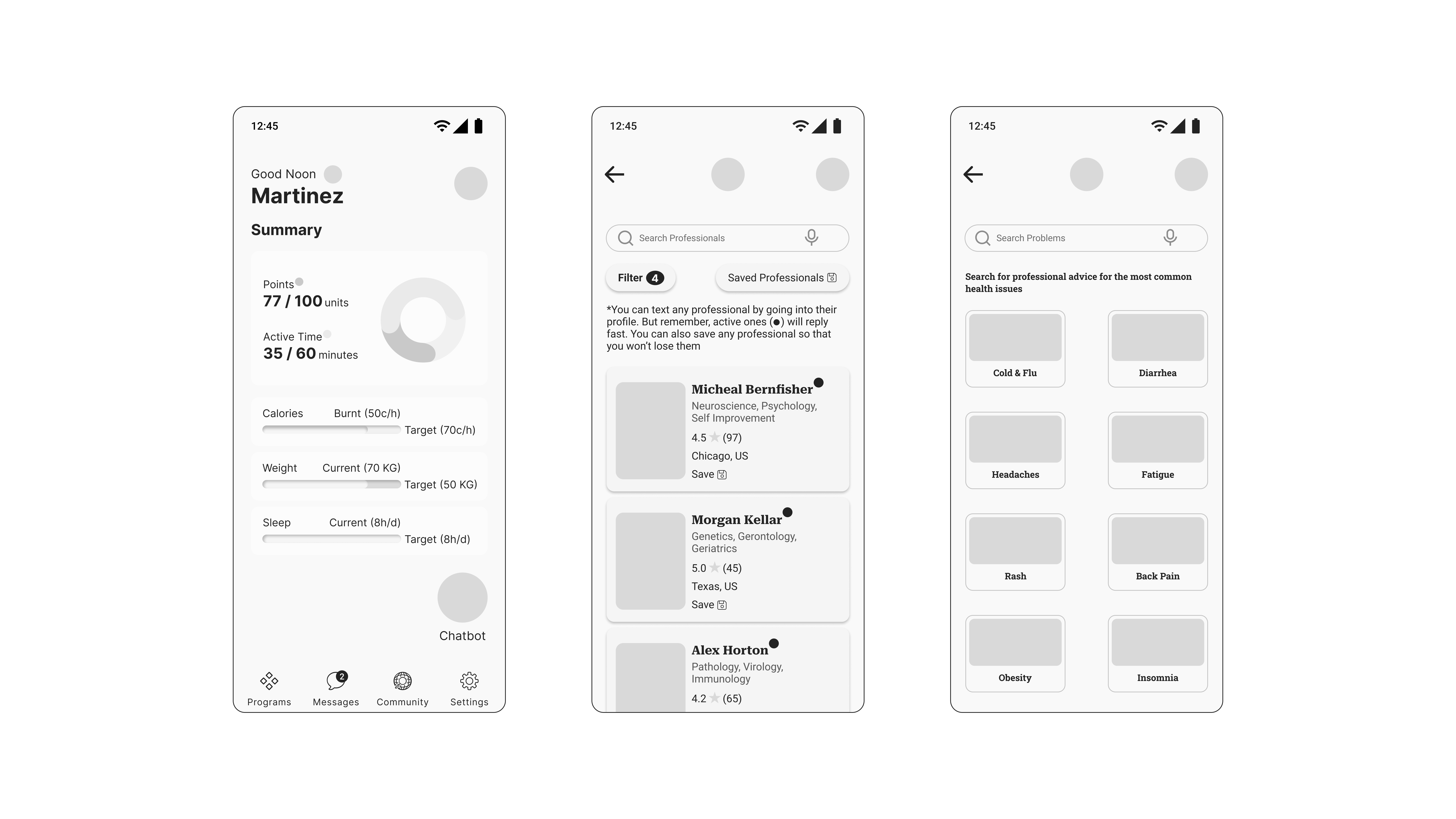
Low & Mid-fidelity Prototype
After having the structured user research, I initiated the design process by creating rudimentary sketches for my application. These sketches laid the groundwork for my project. I elevated these basic sketches into interactive mid-fidelity prototypes in the following phase.
Usability Testing
After having the mid-fidelity prototypes, I proceeded to conduct usability testing on these mid-fidelity prototypes. This decision to test with mid-fidelity prototypes ensured users focused on the functionality and user flow, rather than getting distracted by visual aesthetics. Additionally, mid-fidelity prototypes are quicker and easier to iterate on than high-fidelity ones, allowing for faster design refinement based on user feedback.
See the 'Usability Testing' report here

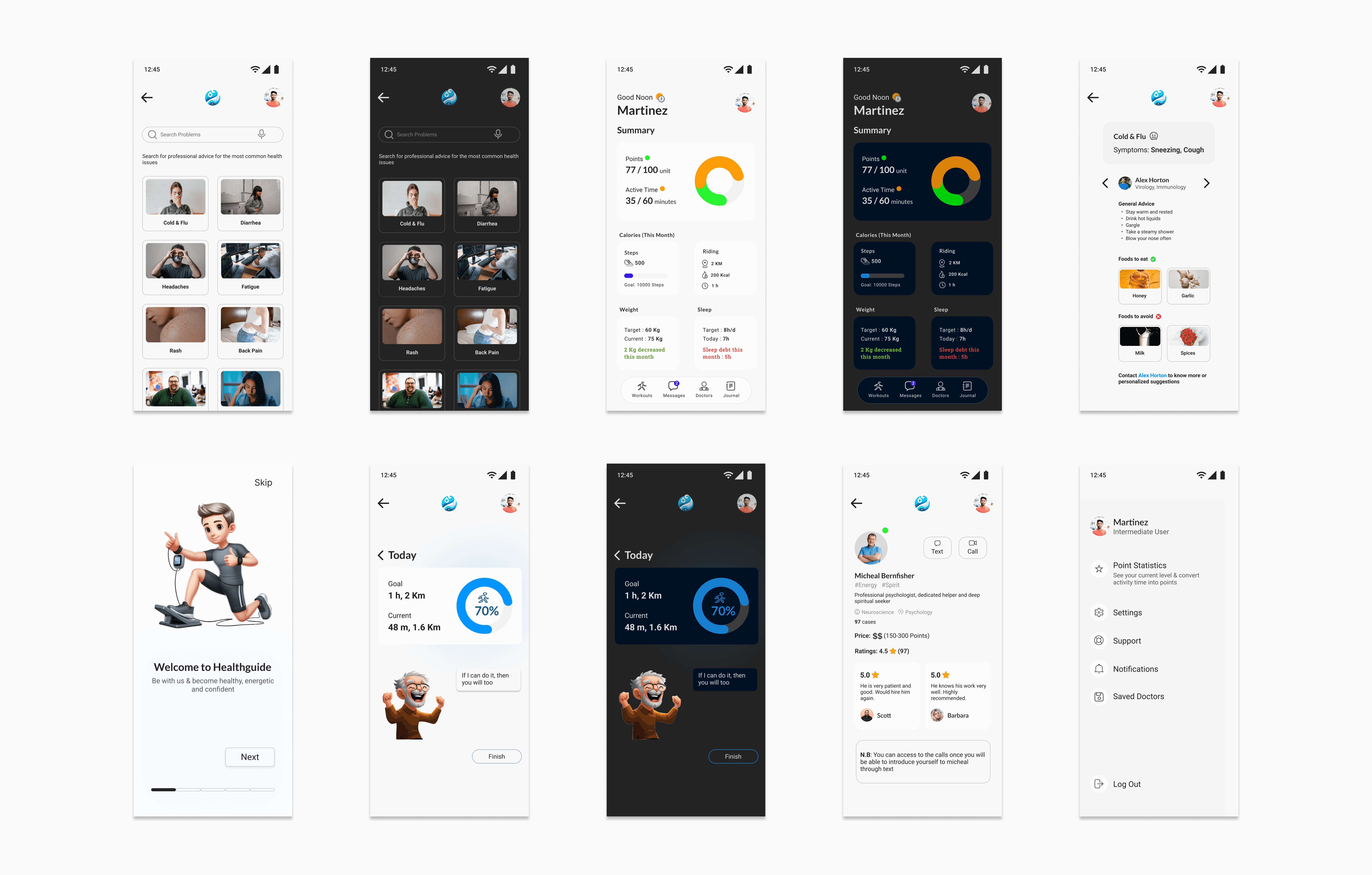
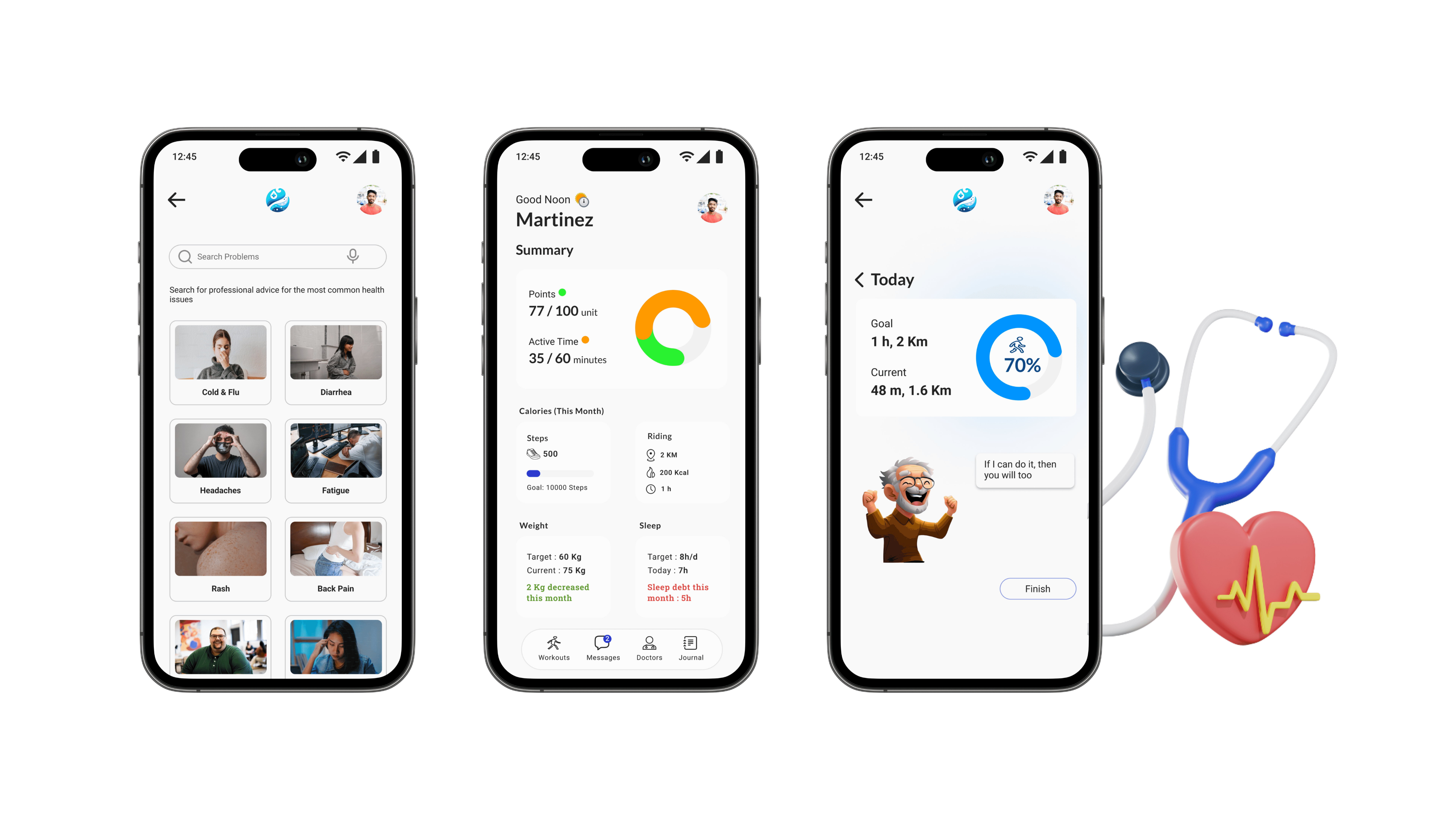
Special Features
I’ve designed specialized features in the health guide specifically to assist individuals on a tight budget in maintaining their health
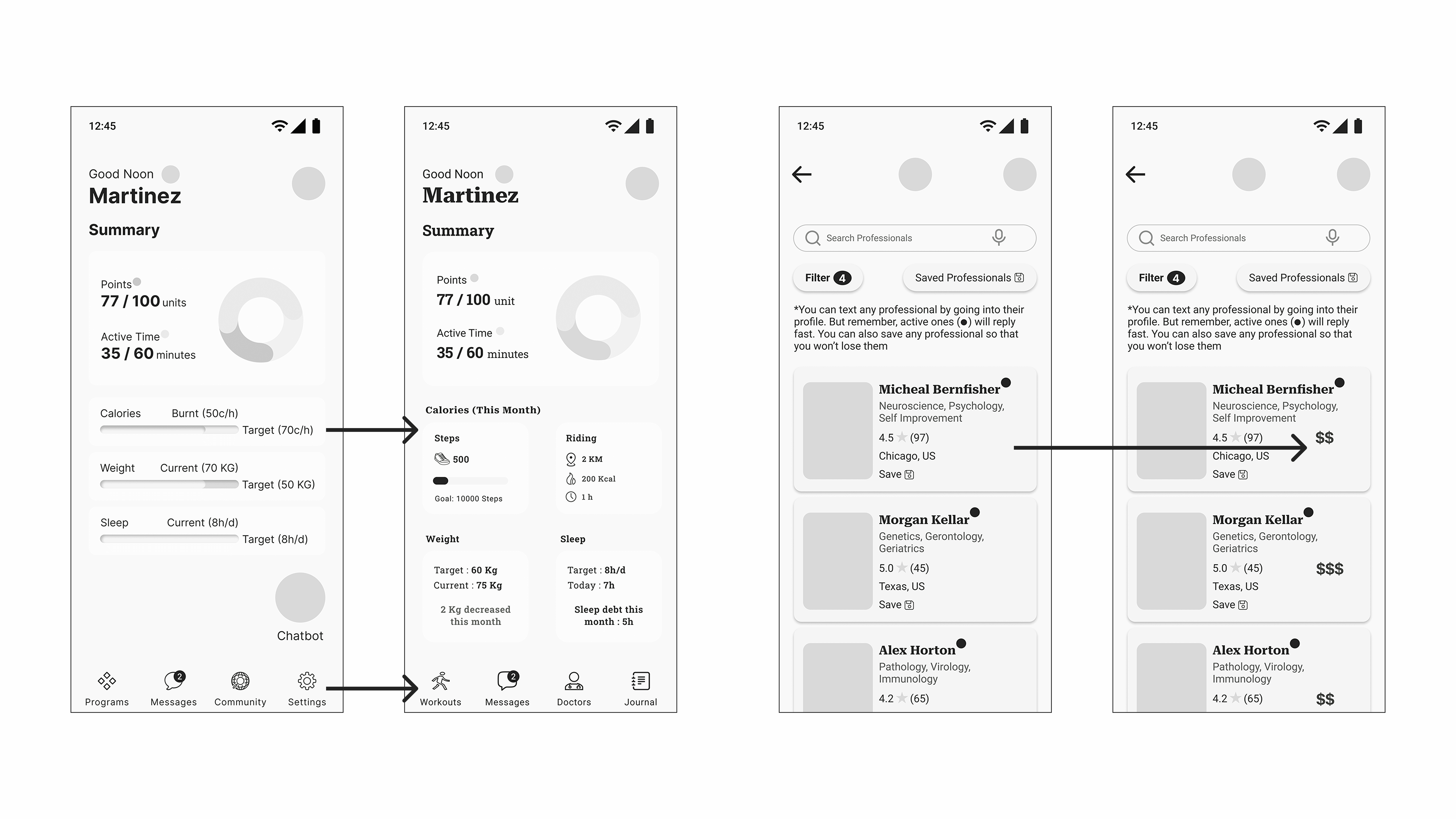
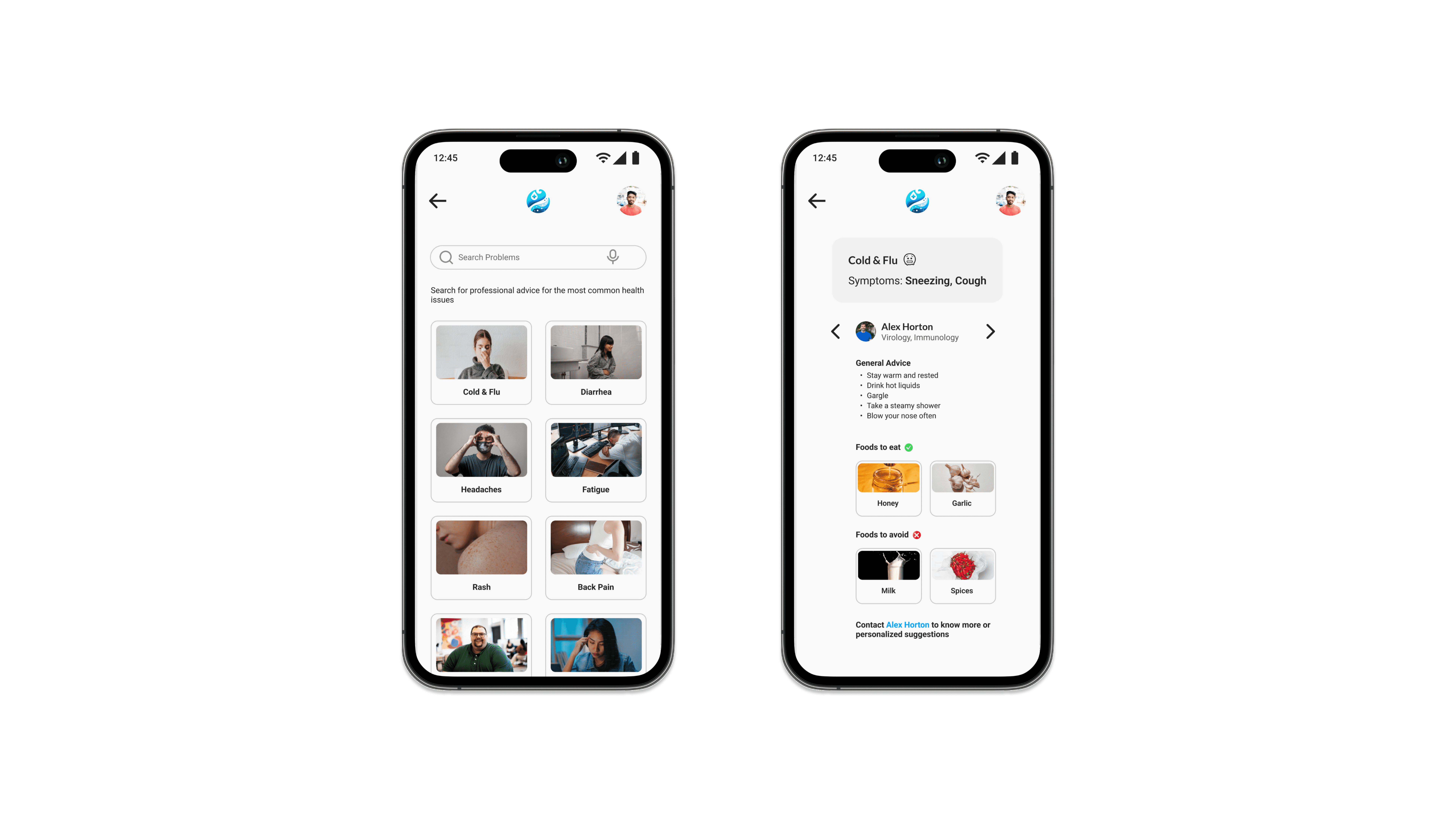
Free Suggestions & Professional Selection Convenience
Budget-conscious users can receive free professional suggestions here.
This allows users to match with professionals whose advice aligns with their needs, minimizing potential mismatches and saving both time and resources for all parties.
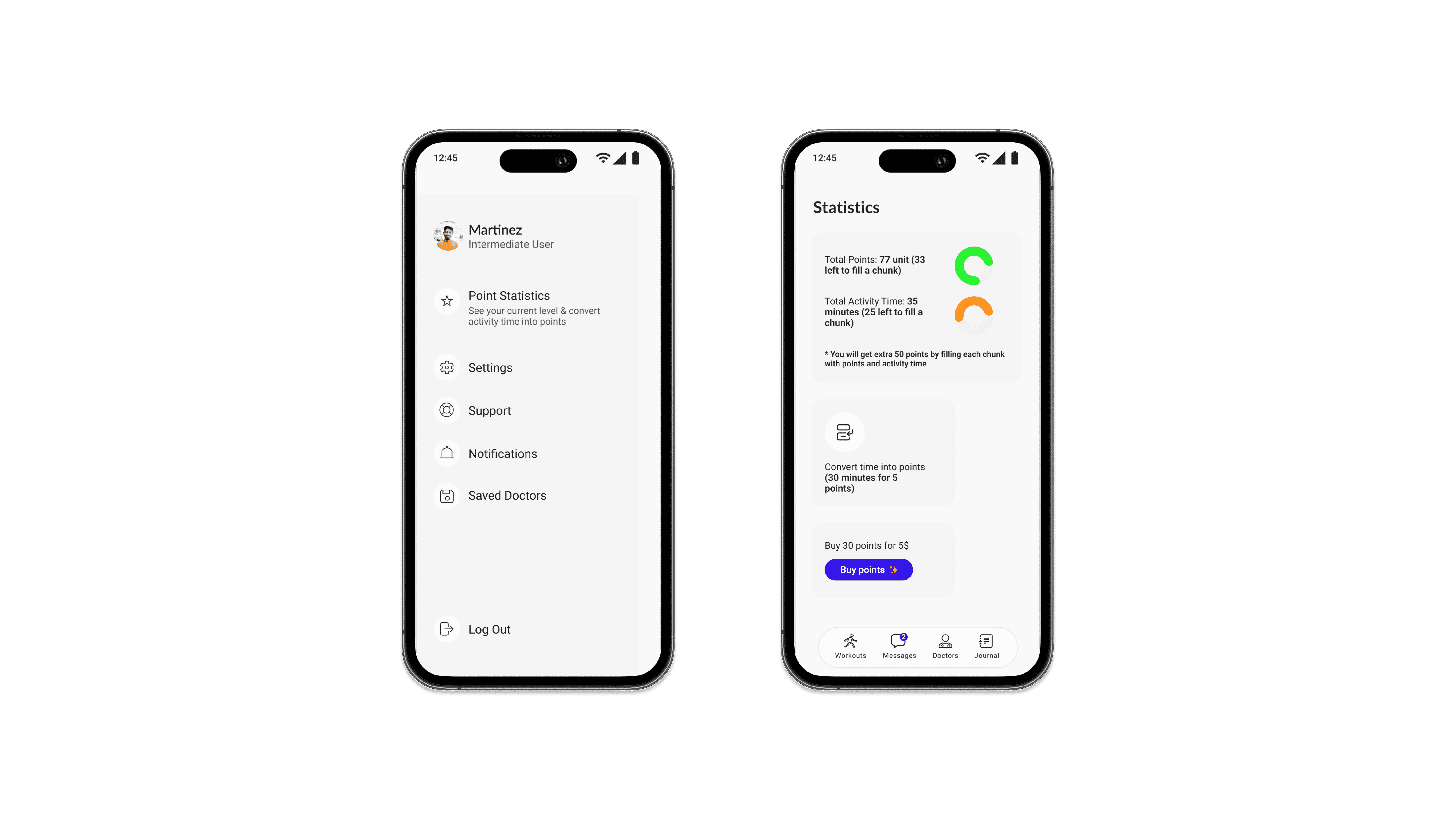
Rewards For Activity Time
Passionate users can convert their Health Guide activity time into valuable points at no additional cost. These points can be redeemed for health items, offering a rewarding incentive for health-conscious users
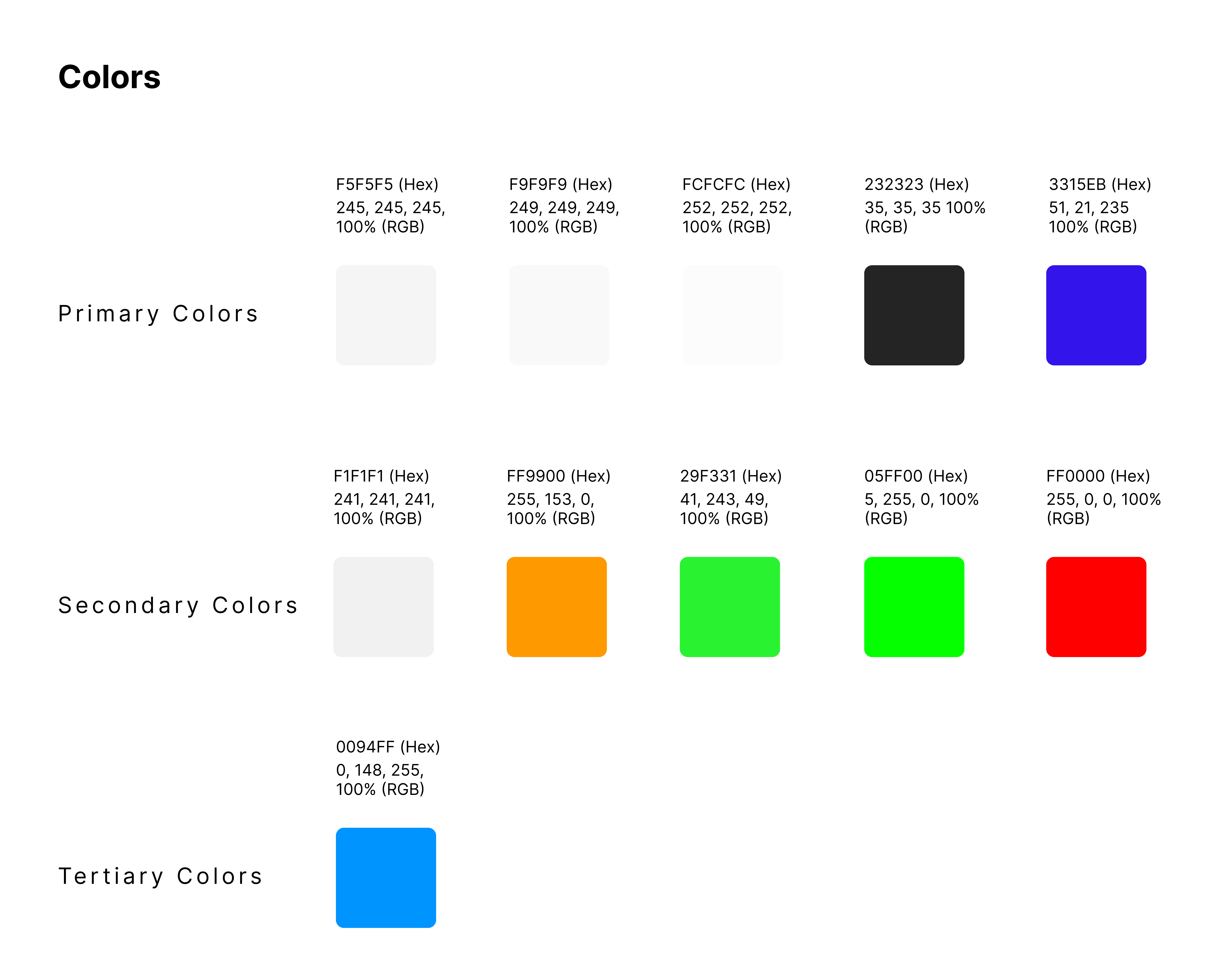
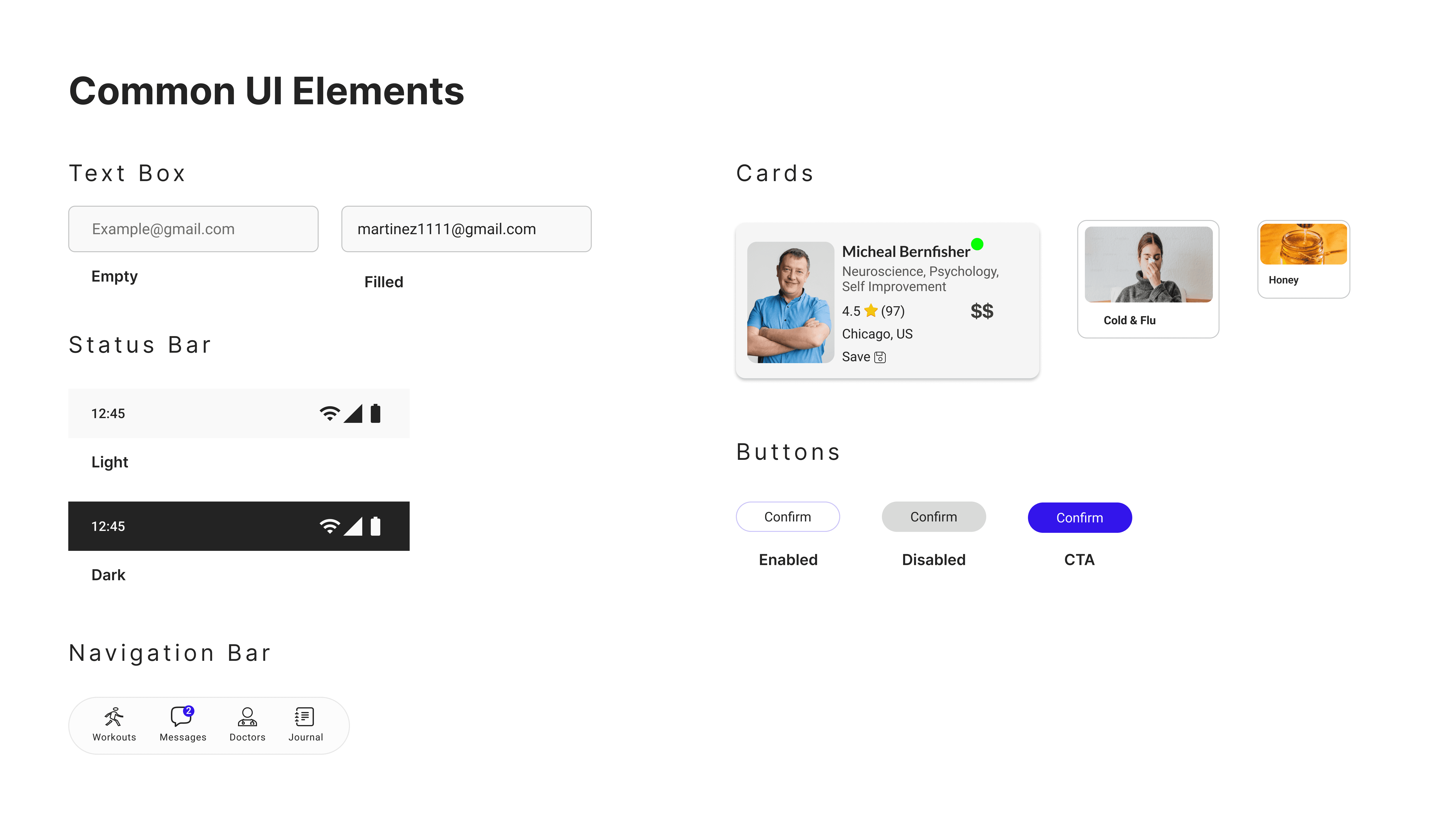
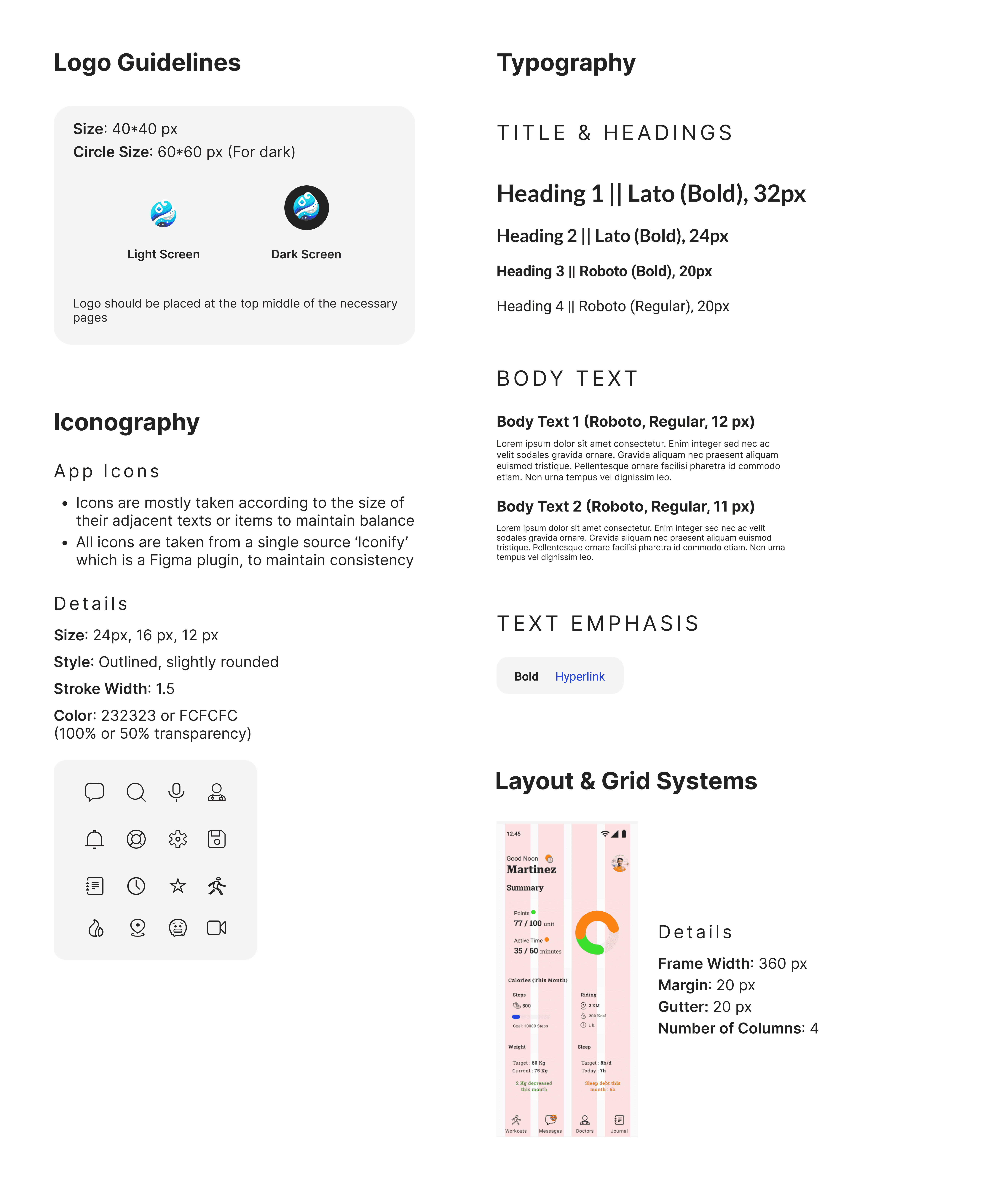
Design System
I’ve created a suite of foundational elements and guidelines that ensure the aesthetic and experiential consistency of the health guide
Final Outcome
Following the refinement of the high-fidelity prototypes, I conducted a final usability test with returning participants. This resulted in a gratifying 13% increase in their average satisfaction level, demonstrating the effectiveness of my design iterations. To maintain consistency, final usability testing was also done with mid-fidelity prototypes like the usability testing before.

See the full 'Final Usability Testing' report here